Tres had commented that the "P" and the "o" of Pockets were too close together, so I made a space a little bigger. What do you guys think? Do you think I should make it bigger?
Hmm....it's good that you played around with it. Maybe move the "P" a pinch, a hair, closer to the "o". Just a smidge over, not a huge leap or anything. If it's possible for you to get it there. By the way, are you working the letter as regular type or by outlines? Just thought I asked.
The P is in outlines because I had to manipulate it a bit. But the rest of the work is just regular type. I will try and play with it a little more. Thanks Tres!!!
this is looking really good katie. I like the playful feel to it. I know you have pushed the design a lot and from where you started out to where it is now, i believe that it is successful. If you choose to push it more I can but i like the way that it looks right now
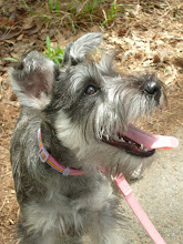
I am a graphic design student at GSU trying to pursue a BFA in the major! This blog is for my GRD3200 class in Spring 09! That's a picture of my puppy Stella!

Hmm....it's good that you played around with it. Maybe move the "P" a pinch, a hair, closer to the "o". Just a smidge over, not a huge leap or anything. If it's possible for you to get it there. By the way, are you working the letter as regular type or by outlines? Just thought I asked.
ReplyDeleteContinue to push Katie! :)
The P is in outlines because I had to manipulate it a bit. But the rest of the work is just regular type. I will try and play with it a little more. Thanks Tres!!!
ReplyDeletethis is looking really good katie. I like the playful feel to it. I know you have pushed the design a lot and from where you started out to where it is now, i believe that it is successful. If you choose to push it more I can but i like the way that it looks right now
ReplyDelete